måndag 27 maj 2013

Assignment 3 - A Poster

For this I went with the Early Music Concert. For the sake of file size and working speed I opted to do this in A4, half of the stated A3 size.

Below is a series of inspiration photos, some old poster/adverts and some more modern pieces and a selection of photos to assist with colour and texture selection.

I really like the old floral patterns, it's something I have admired for a long time and wanted to understand how they are constructed, I have slowly come to the conclusion that the drawings must be inspired by furniture carvings and the depth of the carved wood really shows in some patterns.


I always get this feel of calm and soft lighting from classical music, looking at photography from concert halls there is a strong play with contrast and warm lighting. The black and white clothing, warm red/orange wood from the instruments and the dark backdrops with full lighting focus on the musicians, it's a very soothing atmosphere. 


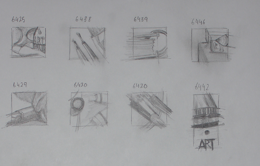
I started off with some rough idea generation sketches.


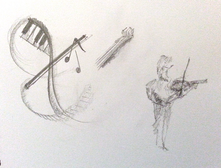
All the above sketches/idea generation was just around objects related to music. I had a couple figures, a conductor and a violinist. I liked the idea of this and felt it would be worth using in some manner, I really like the idea of playing with light and dark and the strong contrasts and focus on the musicians. 


I took my watercolours and tested a figure, where shadows could go. On the same sheet I done some layout options. In the final illustration I used several ideas from the above. The decorative swirls and the layout from the upper right.

I digitally sketched out some floral pattern to use. It feels more modern than the traditional floral designs, it has a generally more rounded look. 


To continue on my idea of using dark and light I went with a very classical colour scheme, dark background with highlighting creme and orange tones. I wanted to use some sort of script typography but nothing that was unreadable or gothic (as used in printing around that era). Looking at the design again now I still fell it works well with the modern/classical look I was going for. 


Some reflective notes: I feel I need to improve my line quality and produce more confident lines in my sketches, I used auto smoothing assists when digitally drawing my lines, I had tried briefly to draw the lines on paper but struggled generating certain angles smoothly (see above, blue ink/wash sketches).
The finished design feels well balanced, the colours work well, although the highlights on the illustration itself could be lighter (but not too much as to over power the text) or maybe adding some strong but small highlights in white might have looked good.

My biggest gain from this has been in the sketching stages and exploring some previously wanted knowledge/know how in the floral patterns. I would really like to explore working with highlights and shall most likely do some further sketching on dark paper.
Another point would have to be the understanding of the importance of capturing the essence of the piece and for example here the atmosphere from a concert hall being identified and transferred to paper (mine is still lacking that warm softness that comes with this).

fredag 24 maj 2013

Outdoor sketching practice

Today I went out with the goal of coming to terms with sketching outdoors. Each previous time I have tried I always ended up with an empty sheet of paper. Today I broke my barrier and sketched some Starlings feeding in the grass. All done in pencil, sketching moving objects such as birds is difficult. I remember hearing from a YouTube video by John Muir Laws that your aim should be to obtain a visual record of the subject in motion, this usually can only be visually store in your mind for a few seconds but that with practice you can retain more information. I managed to do this now, not with perfect results but it was very positive.


Exercise Client Visuals

For this I chose a children's book called Super Charlie. Illustrated by Millis Sarri.


I made the following drawings, top is the replicated version, the below is a reduced line version. 


Both are close to the original in the sense of content, proportions on the other hand were not quite as close. 
Looking now a few days later I really should have taken away the pictures behind the toilet, the toilet paper could have gone as well. Just seeing the baby sat on the toilet is enough to understand where he is and what he is doing, therefore I could have taken away more lines. 

It is an interesting approach to a picture. Well worth exploring more, creating a full line visual and see what can be taken away but still have meaning. 

Exercise Making a mock-up

Initially I thought about taking a self help book. I tried some sketches around the idea of your own mind stopping you from achieving or doing certain things. I had some self doubts on the strength of the meanings after a poor result on the earlier visual metaphor exercise. 


Based on my doubts and really enjoying painting birds I opted for a bird book cover. I had previously been drawing and painting some birds and thought I would put the pictures to use. 


I tried to re-create it as close as I could but to fit my illustrations, because my illustrations were in a slightly different format I had to look at other options of the layout and I felt the red tones really complemented the colours of the birds. I am a long way off from the illustrations in a field guide but had seen some less scientific illustrations used on Collins Bird Guide.  

In addition to the above I decided to mock up one of my sketches and use a book by Dale Carnegie - How to Stop Worrying and Start Living. 

I tried to replicate it as close as I could but the cover had no illustration so I had to re-work the text size and arrangement a little. The typeface is very likely correct but a different variation of it, Century Schoolbook. 


This is how the converted sketched turned out. After adding it to the design I realized the colours didn't work, I tested the base colour of the book and it instantly looked better. The grey in the traffic lights didn't match well either, white felt most suitable. 


The whole brain traffic lights concept was about your mind stopping you from moving forwards, in the same way a traffic light stops a car from moving forwards, even though you can drive through a red light you choose not to, the principals in the book are similar. You could move forwards and start living but choose not to. I showed the idea to my wife and she thought showing green lights would be more positive, that the lights have changed and you can 'start living' now the lights are green. This felt like a good suggestions and for a change I took the advice.

onsdag 22 maj 2013

Exercise Viewpoint

I chose the word Workshop, out of all the words this was the one that had the most options for me. I arranged my paint/drawing "workshop" and took a total of 39 photos from as many angles as I could. 

From the 39 photos I picked out 7 of interest, some zoomed on areas of interest like the kneed-able eraser, spiral bound sketchbook and the aerial view.


Below is some crops I felt worked well and fitted in with workshop. The 3rd image from the top left was good but maybe not so understandable with the word workshop, the first image ended up being the one that summarized the word best. 


tisdag 21 maj 2013

Exercise Abstract Illustration

For this I chose Beethoven and the piece was the 9th Symphony, a rather vibrant piece of music, good balance of speed and emotion.

I felt I could quickly apply chalk pastels better than any other medium and done this illustration in my A4 sketchbook.


My chosen word for this piece is 'Uplifting'.


Looking at the final edited crop I'm not actually sure if it would suite for a Beethoven cover but might suite Jazz better. 


onsdag 15 maj 2013

Exercise Giving Instructions

A selection of reference materials I used.

As an aim to experiment more I thought for this I would use pen and ink and watercolour washes and felt the looseness of Quentin Blake would be a good direction for me, I often feel my work is too clinical and potentially uninteresting at times. I watched and listened to this: https://www.youtube.com/watch?v=D9cAVt80lNY

An excellent video where you get to see how Blake approaches a project, draws and paints. A priceless insight to the mind of Blake.


I tried to find references to objects drawn, Blake's main focus is people, motion, action and emotions. Objects were more difficult to come by but in the end I did manage to find some.


I liked the simplicity in them all, the nappy instructions at the top aren't very clear. They all use a very limited colour scheme. All but the top one are boxed in sections, I would like to try and break away from all the above and see what the results are.


I played around with some ideas on making the cup object more interesting in some, stretching it's proportions, changing the shape, I even tried a skull shaped cup. 


I identified what I felt was the key moments/steps in making a cup of tea and made the list: 

• Pouring water in kettle
• Boiling water
• Preparing cup (choosing cup)
• Tea bag
• Milk and sugar
• Filling up cup
• Stirring


From this I moved on to watercolour paper and drew all the objects in pen and ink looking at my sketches, no pre-drawn lines, I wanted it to be a loose and free as possible.


I just realized I forgot to photograph the line drawings in pen and ink before adding watercolour. Above are the finished drawings. 

I then had the job of refining the pieces digitally and putting together an instruction sheet.

Keeping with my aim of creating a loose piece I tried this background


The above background is subtly placed over a light creme coloured background and a block of old hand written text. The effect comes off as neither old nor new and seems to complement the illustrations rather well. 

I showed my wife to gather feedback and she straight away picked up on a few things: 

1. She wasn't sure on the order of the objects in the instructions - I think this is why sections of instructions or each step is usually boxed off and numbered. 

2. She felt not every instruction step was clear - the tap and water I felt was obvious but she said the kettle in view would be more logical. The tea in the box never enters the cup when you look at the illustrations and the milk and sugar step wasn't clear, she wanted to know what you do with the milk and sugar and wondered even if that was a box of milk. Maybe I should have added the word "milk" to the cover. 

When I looked more at it I felt the order could change as well to make it more clear.


With a little wording and slight re-arrangement of objects it becomes much clearer and easy to follow and understand. 

I might come back to this at a later date and look at alternative version boxed in and numbered. 

I'm pleased with the visual outcome and happy to get the feedback, I was fairly set that my work was complete and understandable, I now know to think about this when approaching the following pieces.