For this I went with the Early Music Concert. For the sake of file size and working speed I opted to do this in A4, half of the stated A3 size.
Below is a series of inspiration photos, some old poster/adverts and some more modern pieces and a selection of photos to assist with colour and texture selection.
I really like the old floral patterns, it's something I have admired for a long time and wanted to understand how they are constructed, I have slowly come to the conclusion that the drawings must be inspired by furniture carvings and the depth of the carved wood really shows in some patterns.
I always get this feel of calm and soft lighting from classical music, looking at photography from concert halls there is a strong play with contrast and warm lighting. The black and white clothing, warm red/orange wood from the instruments and the dark backdrops with full lighting focus on the musicians, it's a very soothing atmosphere.
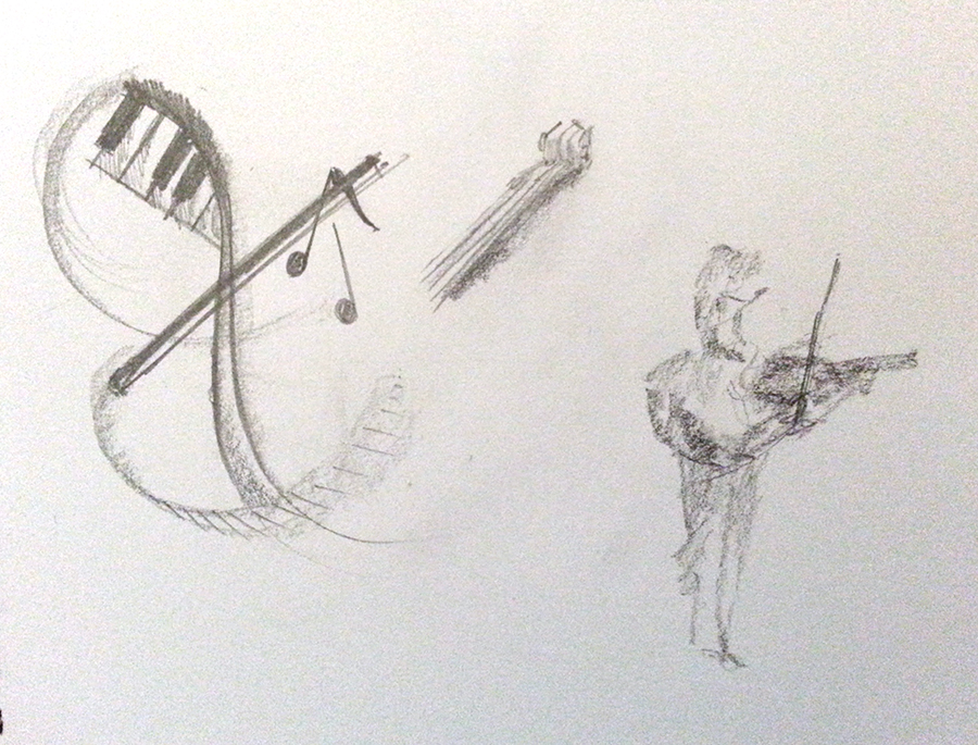
I started off with some rough idea generation sketches.
All the above sketches/idea generation was just around objects related to music. I had a couple figures, a conductor and a violinist. I liked the idea of this and felt it would be worth using in some manner, I really like the idea of playing with light and dark and the strong contrasts and focus on the musicians.
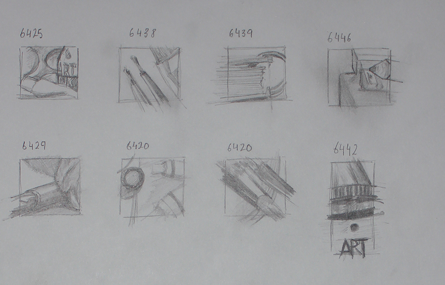
I took my watercolours and tested a figure, where shadows could go. On the same sheet I done some layout options. In the final illustration I used several ideas from the above. The decorative swirls and the layout from the upper right.
I digitally sketched out some floral pattern to use. It feels more modern than the traditional floral designs, it has a generally more rounded look.
To continue on my idea of using dark and light I went with a very classical colour scheme, dark background with highlighting creme and orange tones. I wanted to use some sort of script typography but nothing that was unreadable or gothic (as used in printing around that era). Looking at the design again now I still fell it works well with the modern/classical look I was going for.
Some reflective notes: I feel I need to improve my line quality and produce more confident lines in my sketches, I used auto smoothing assists when digitally drawing my lines, I had tried briefly to draw the lines on paper but struggled generating certain angles smoothly (see above, blue ink/wash sketches).
The finished design feels well balanced, the colours work well, although the highlights on the illustration itself could be lighter (but not too much as to over power the text) or maybe adding some strong but small highlights in white might have looked good.
My biggest gain from this has been in the sketching stages and exploring some previously wanted knowledge/know how in the floral patterns. I would really like to explore working with highlights and shall most likely do some further sketching on dark paper.
Another point would have to be the understanding of the importance of capturing the essence of the piece and for example here the atmosphere from a concert hall being identified and transferred to paper (mine is still lacking that warm softness that comes with this).


